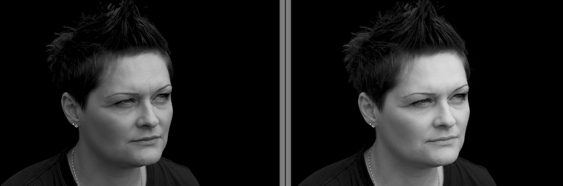
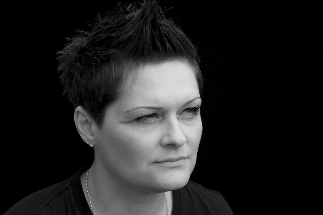
Exercise: Colours into tones 2
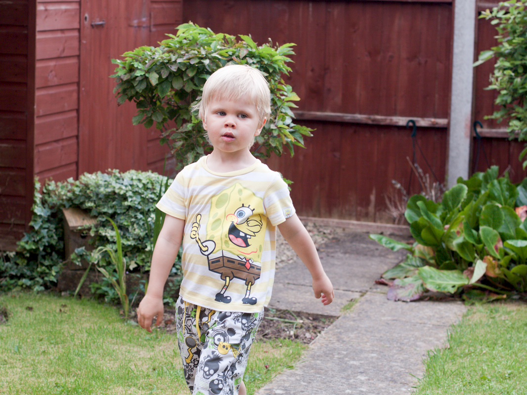
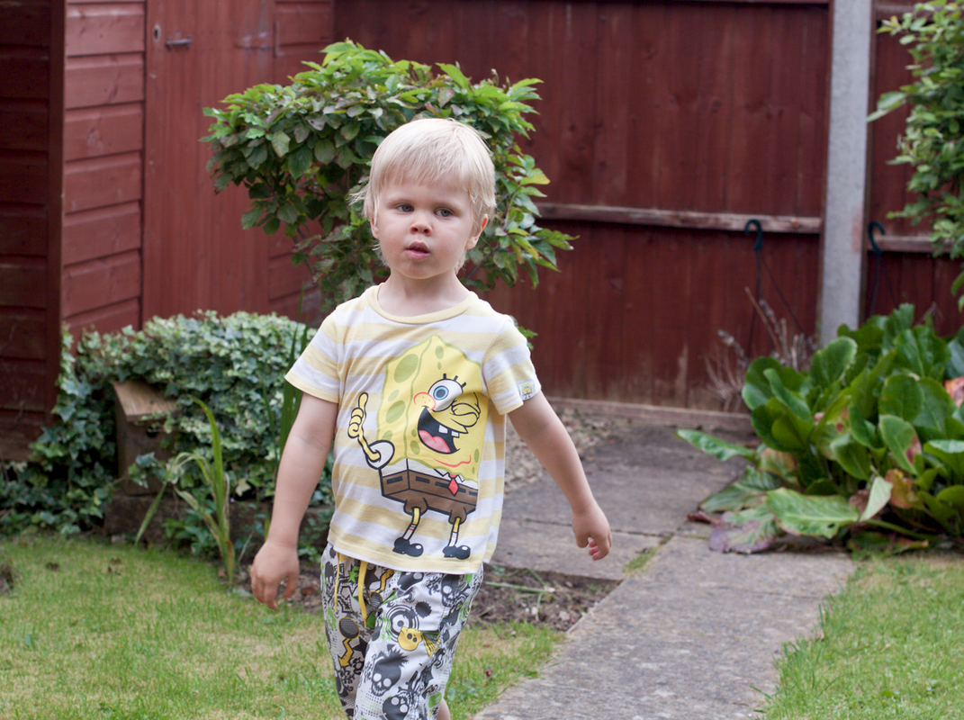
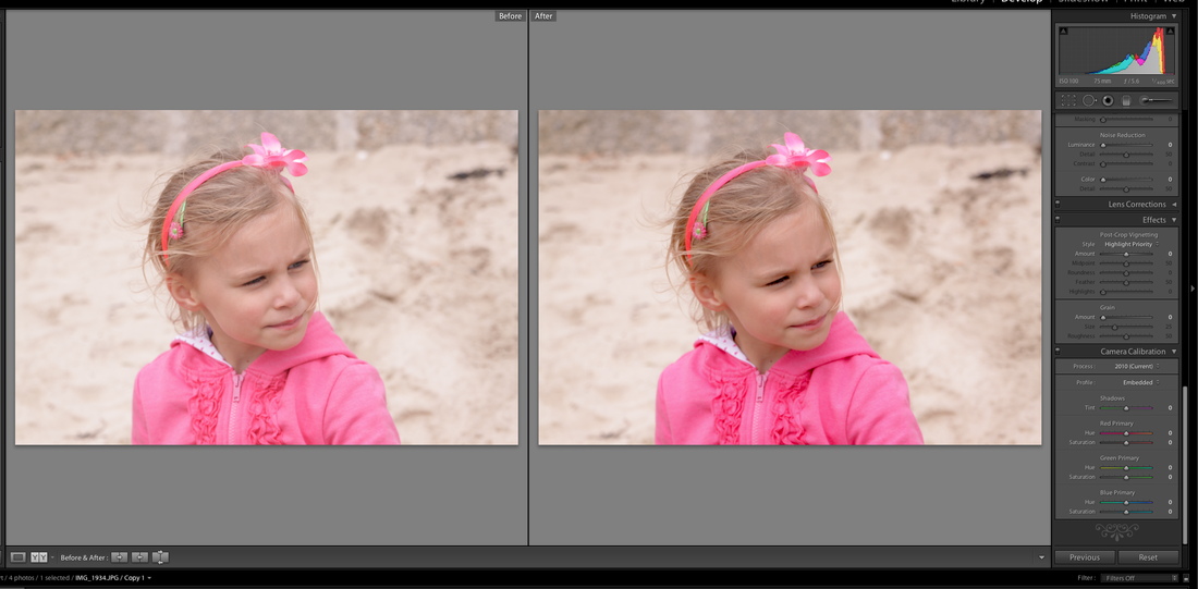
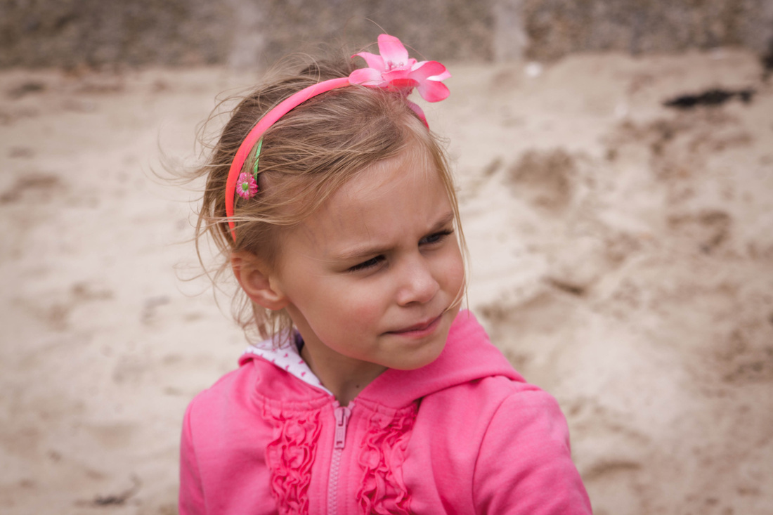
For this exercise I need use the chanel adjustment to create a specific effect: a portrait making the skin lighter but without altering the rest of the tones. I used Lightroom to make my adjustments.
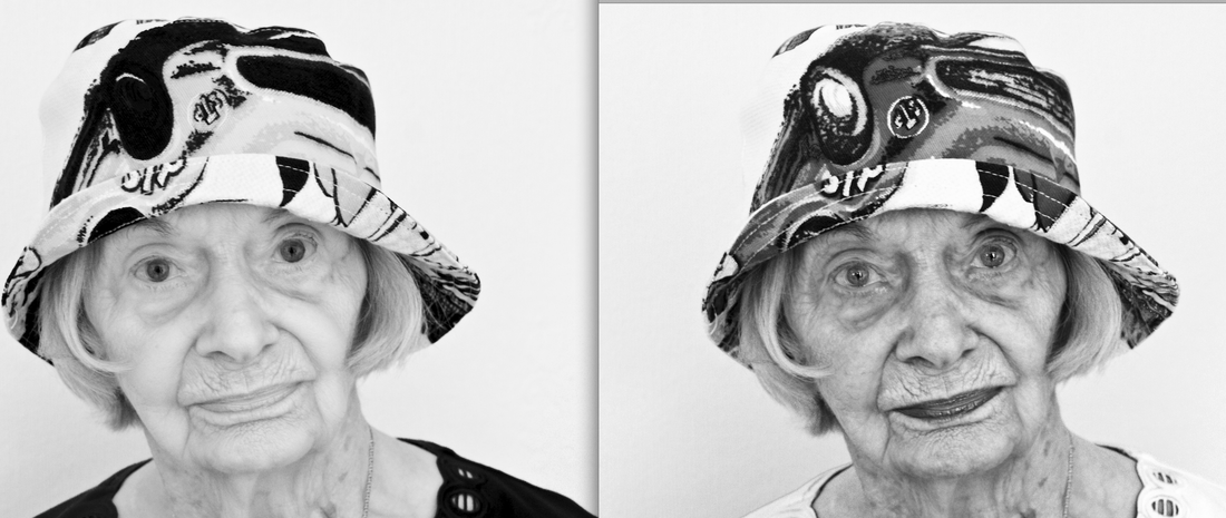
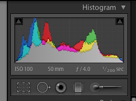
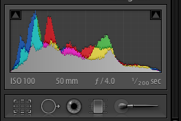
Using the basic conversion the skin is very dull and mid- grey toned.
I increased the red and orange sliders to change the tone of the skin and additionally used a tone curve adjustment to darken the blacks.
Using the basic conversion the skin is very dull and mid- grey toned.
I increased the red and orange sliders to change the tone of the skin and additionally used a tone curve adjustment to darken the blacks.
Basic conversion Skin lightened
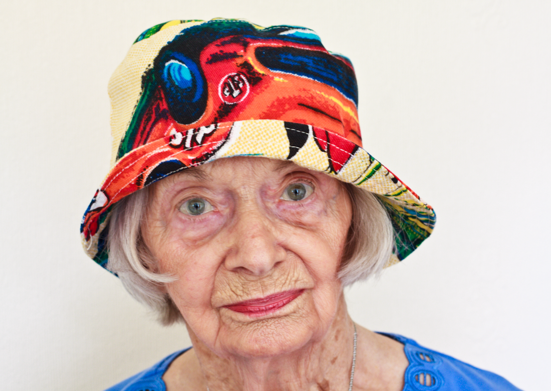
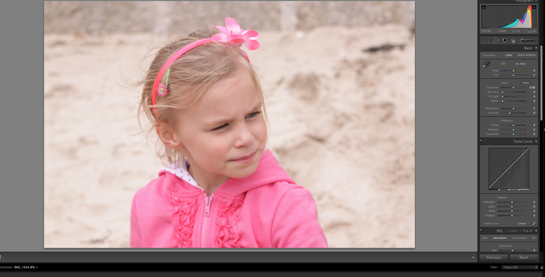
Exercise : Colours into tones 1
For this exercise I need to choose a colourful image with contrasting hues with the aim of creating two different Black and White versions. For one image I need to lighten the grayscale tone of one colour whilst darkening the contrasting tone of the other , and then do the reverse.
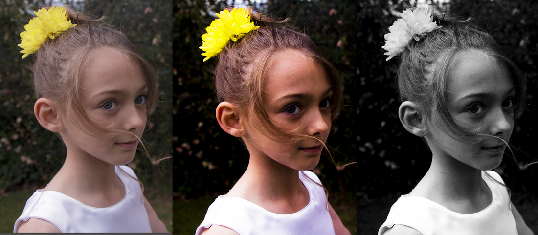
My mum has a rather bizarre collection of hats and I took this image of her wearing one of them , which has bright orange and blue tones , additionally her blue top contrasts well with her lipstick.
My mum has a rather bizarre collection of hats and I took this image of her wearing one of them , which has bright orange and blue tones , additionally her blue top contrasts well with her lipstick.
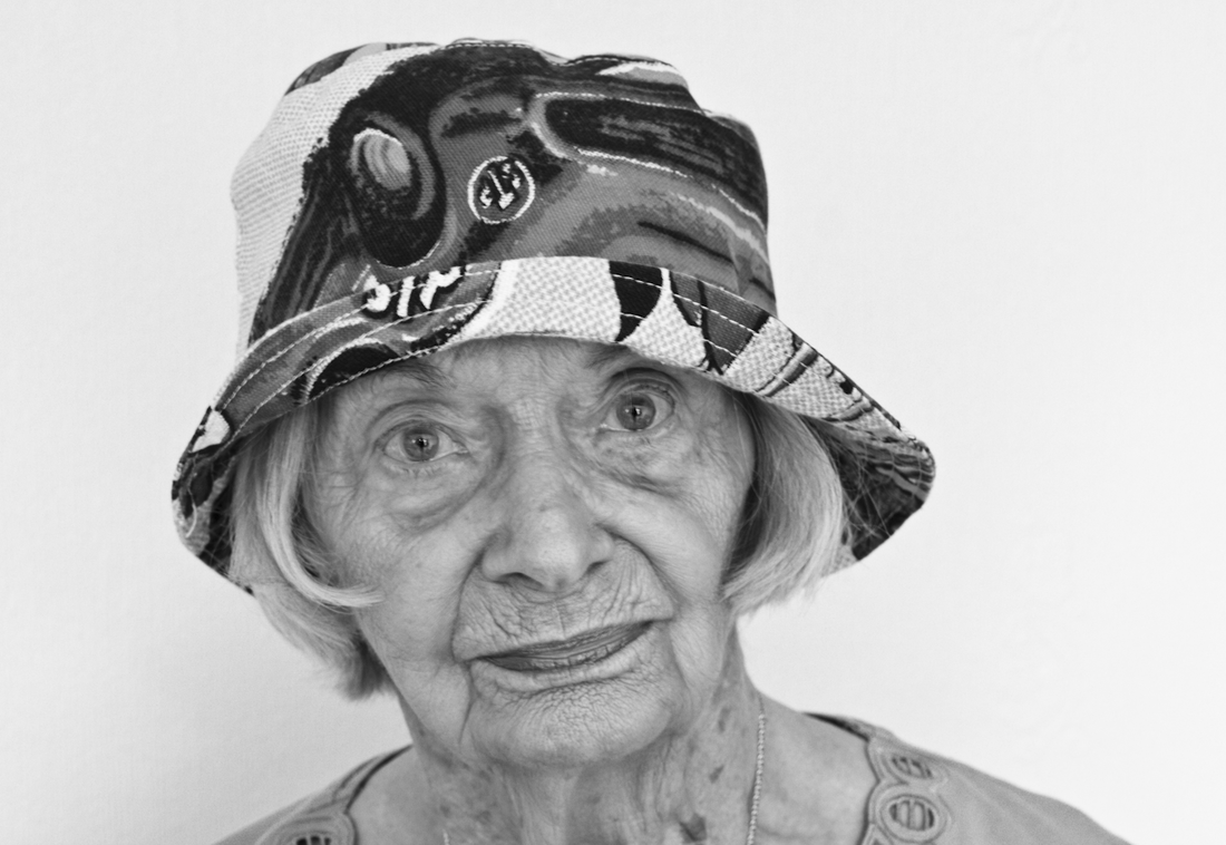
This is the default Black and White conversion using Lightroom.
The skin tones look mid grey -not a really good conversion, the hat is not too bad though.
The skin tones look mid grey -not a really good conversion, the hat is not too bad though.
Version 1 Version 2
My first conversion shows the effect of using the Black and White mix slider in Lightroom increasing the saturation of the red, yellow , and orange tones , whilst decreasing blue, purple and magenta. The blue top Mum was wearing has become markedly much darker , black in fact , as have the blue areas of the hat. The orange and yellow colours have become much paler varied tones of grey to almost white—some of the pattern seems to have vanished. This conversion has had a detrimental on the skin tones creating loss of depth and textural detail , her lips have become paler (she was wearing a red/ orange toned lipstick) , creating a rather strange facial appearance.
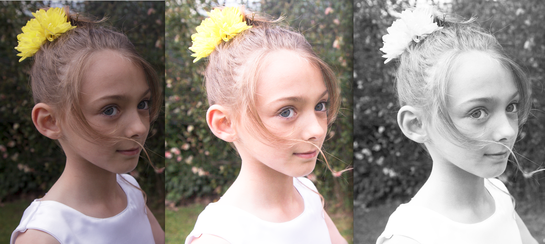
My second conversion was the reverse making the orange tones darker and the blues lighter. I increased the blue , magenta and purple saturation and decreased the red . Her top is now practically white , her lips and have skin are darker creating a greater range of tonal and textural detail. The hat now has more varied shades of grey from darkish black to light almost white , the pattern completely different.
It is fascinating to see just how much the colour channels can be used to alter the appearance of a Black and White image—that almost sounds like an oxymoron.
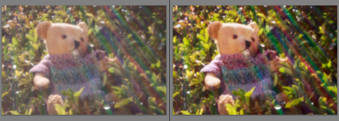
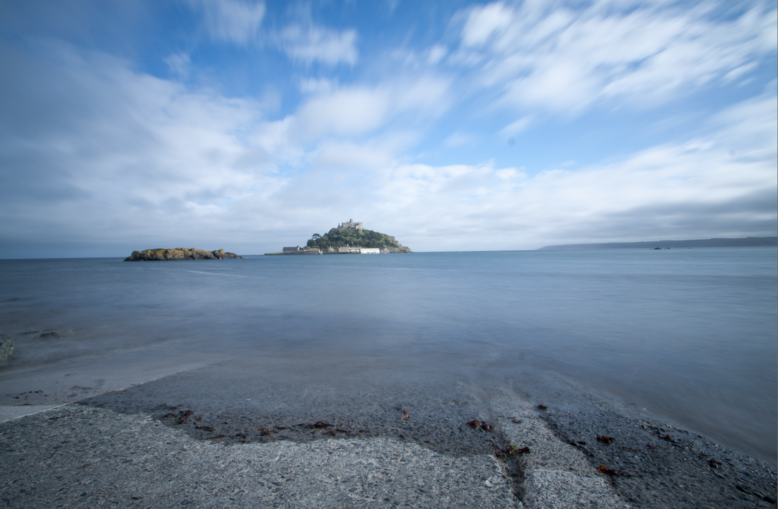
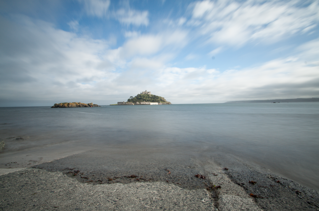
Exercise : Strength of interpretation
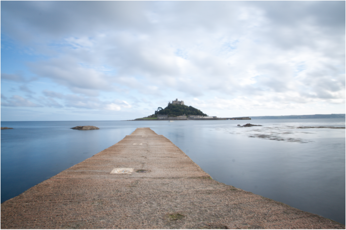
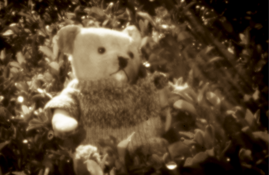
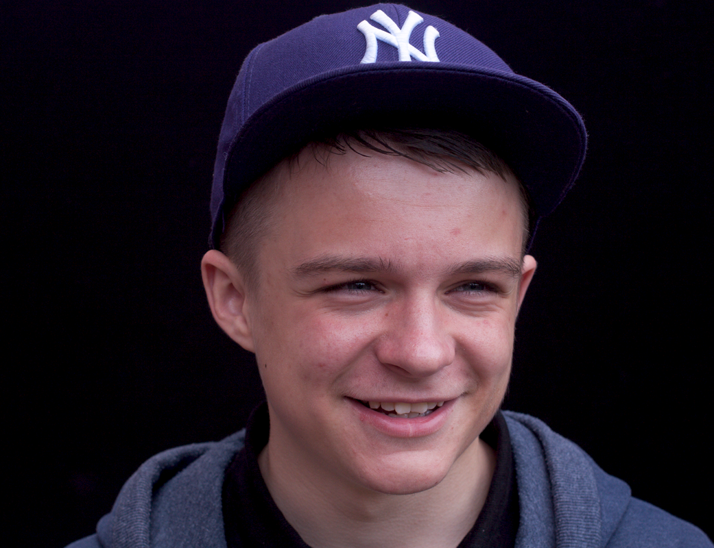
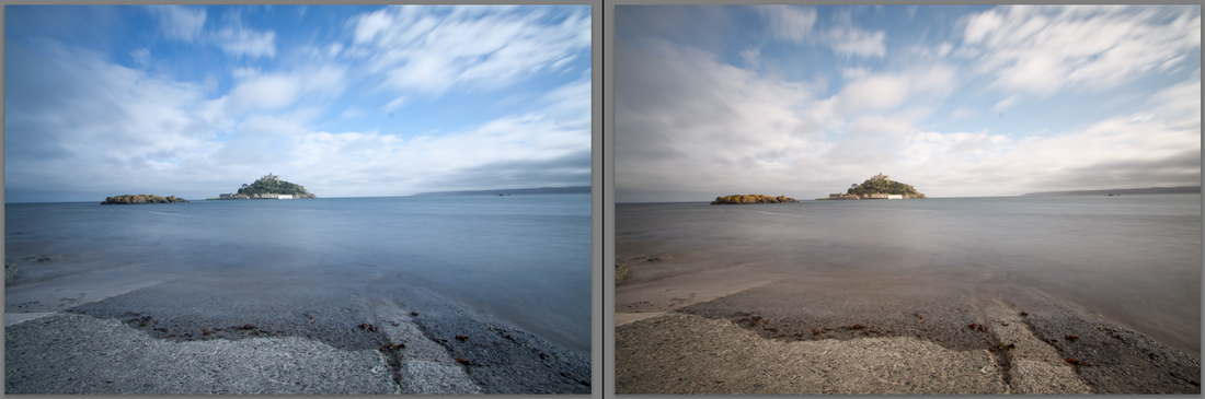
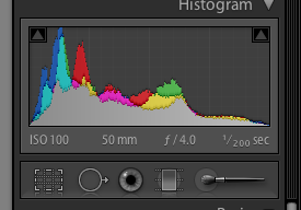
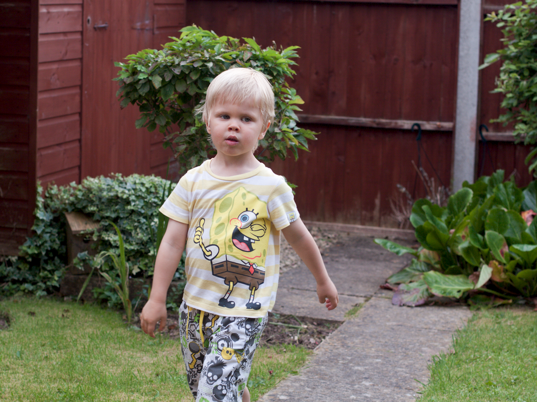
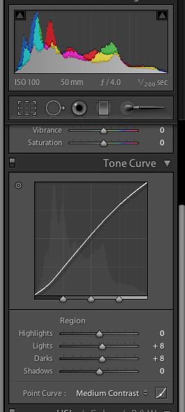
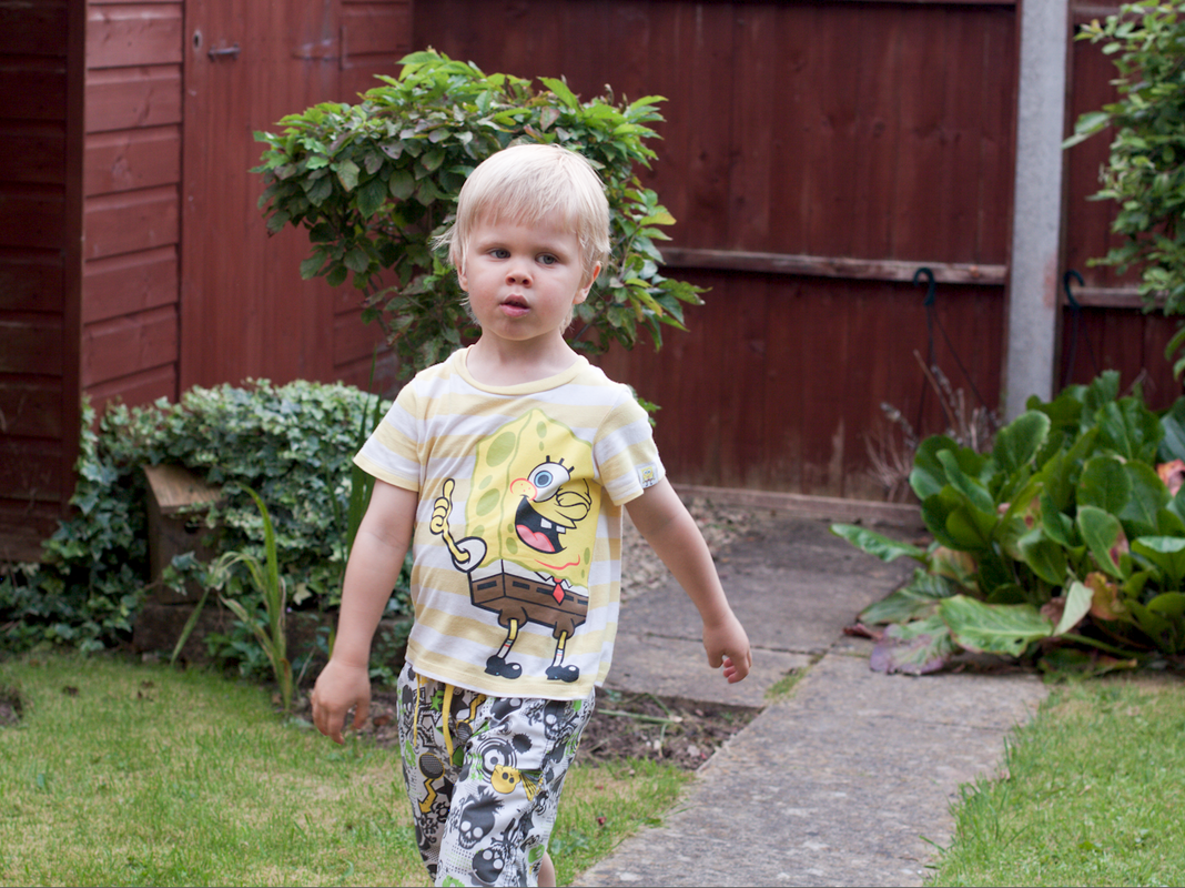
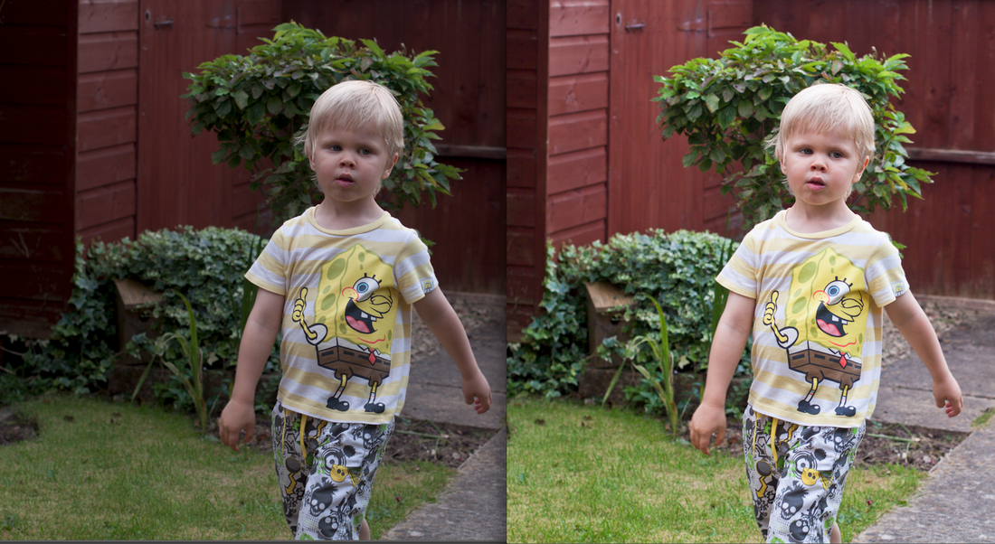
This exercise looks at the effect aggressive processing has on an image and how it is possible to use it to greater advantage when converting to black and white . I used Lightroom to process each of my chosen images , one portrait and one landscape.
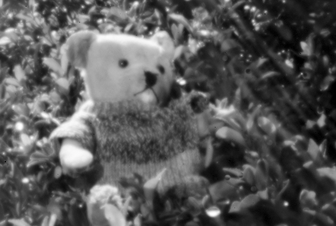
Simply by quite drastically altering the contrast and Curves using the LR tools there is more leeway when processing a black and white image than colour. I attempted an S curve to create greater contrast and as can be seen the hues have become quite garish in both colour versions. In comparison the mono versions (although I find the skin in the portrait perhaps a bit too darkly toned ) are both acceptable. When reversing the process to create a much lighter version once again the black and white images suffer least from the post-processing.
Simply by quite drastically altering the contrast and Curves using the LR tools there is more leeway when processing a black and white image than colour. I attempted an S curve to create greater contrast and as can be seen the hues have become quite garish in both colour versions. In comparison the mono versions (although I find the skin in the portrait perhaps a bit too darkly toned ) are both acceptable. When reversing the process to create a much lighter version once again the black and white images suffer least from the post-processing.
Original Raw file .
The processing caused clipping in the shadows when I applied an S Curve tone adjustment but this is much less of a problem for the mono version , it creates a dramatic scene. Whilst I prefer the greater contrast of the low key mono version the high key treatment is still perfectly acceptable , how the final image is interpreted is very much a personal choice.
The processing caused clipping in the shadows when I applied an S Curve tone adjustment but this is much less of a problem for the mono version , it creates a dramatic scene. Whilst I prefer the greater contrast of the low key mono version the high key treatment is still perfectly acceptable , how the final image is interpreted is very much a personal choice.
 |  |
 |  |
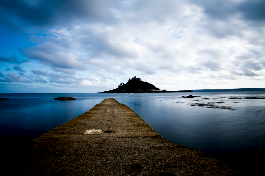
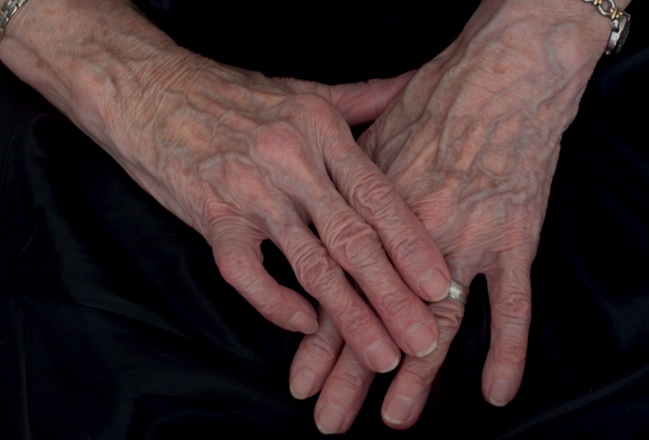
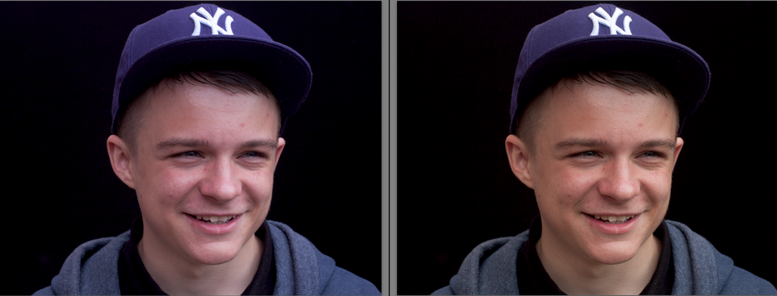
Exercise : Black- and –white
Why is Black and White photography so popular and what makes it so unique? One of my favourite photographers , Jane Bown, works exclusively in black and white, her portraiture is inspirational. She comments “Black and white is quiet , where colour is noisy and distracting, and I feel that it allows the personality of the sitter to come through” Pg. x Introduction Observer Books “ Exposures Jane Bown” , Guardian Books , London 2009. She succinctly describes the great beauty and attraction of black and white photography , stripped of colour black and white imagery relies on tone , texture , shape , and key tones. I frequently convert my portrait shots to mono as I find them visually and aesthetically pleasing. I don’t have a particular method of working but sit and “tweak” the various slider controls--- hue/saturation , tone curves , contrast , clarity etc. until I am happy with the result. Its probably a really haphazard way of working but it suits me .
For this exercise I need to think in mono—not something I consciously do when taking photographs. This is an interesting concept as I usually take my shots and decide after shooting which will work better in black and white. I decided to use my long-suffering Mum as a model yet again , but the difference this time was to try and visualize how the tones and textures would look before converting to mono. Having photographed mum lots of times I know that her hair and skin can create great textural detail so important for successful mono conversions. For this exercise I chose to shoot her hands. Old hands , such as mum’s , translate well to black and white.
It was relatively easy to imagine how the image I was going to take would look in mono as she was wearing a black skirt and I asked her to rest her hands on her lap to form a triangular shape. Shape and texture were easy to pre-visualize , the actual skin tones I found a bit more difficult to think about in black and white terms. However I knew her paler skin would provide a good contrast against the dark background. She will not thank me for saying this but I think old hands are so fascinating to photograph , the raised veins and wrinkles seem to become more pronounced when converted to black and white.
Original Raw file below prior to optimising and processing.
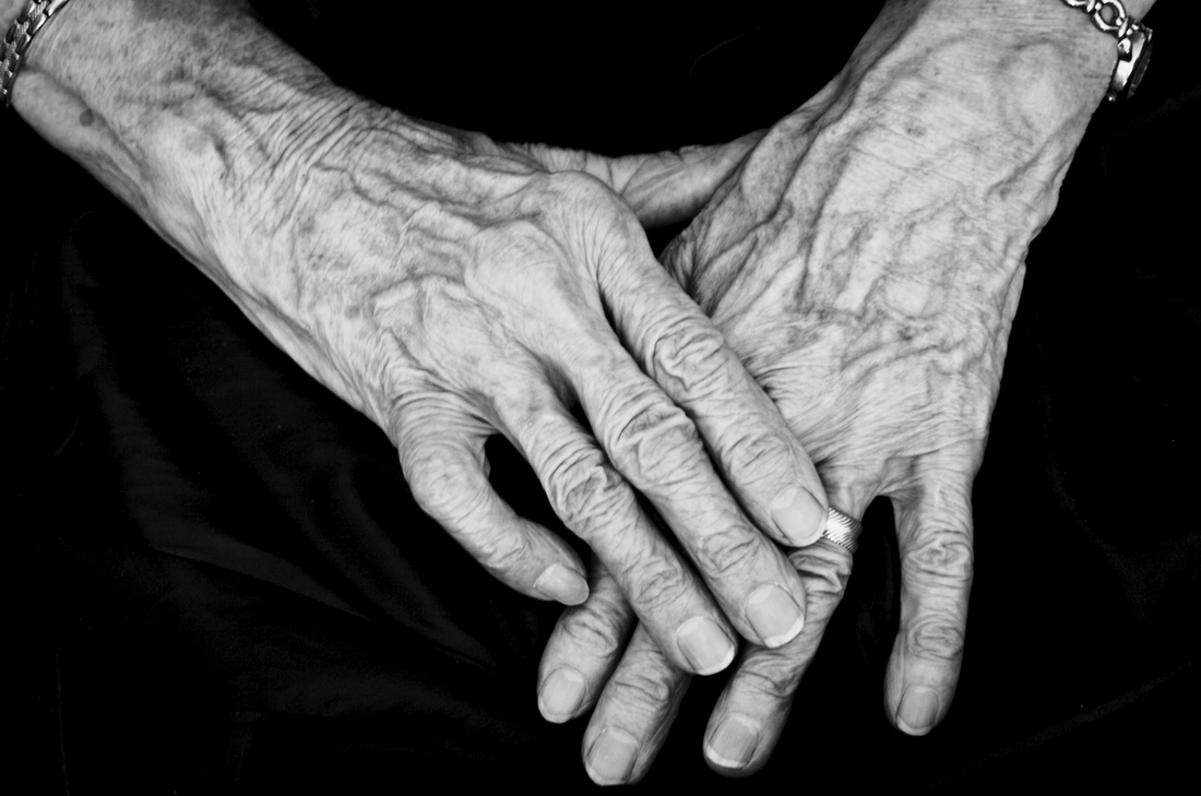
Converted to Black & White initially using the Basic conversion button in LR.
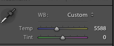
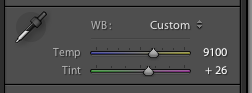
As I have said I do not have a particular method of working and assess each image individually as I process it. I used quite a strong tone curve adjustment , I wanted quite a strong contrast between the dark and light tones. I also experimented with the WB , Camera Calibration and HSL settings tweaking until I was happy with the resulting tones. I also increased the Clarity by + 50. I really feel the final Black and White image has greater visual impact than the original colour version.
As I have said I do not have a particular method of working and assess each image individually as I process it. I used quite a strong tone curve adjustment , I wanted quite a strong contrast between the dark and light tones. I also experimented with the WB , Camera Calibration and HSL settings tweaking until I was happy with the resulting tones. I also increased the Clarity by + 50. I really feel the final Black and White image has greater visual impact than the original colour version.


 RSS Feed